Wednesday, October 27, 2010

Sterilite for Scrapbookers!

Hi! I just wanted to do a post on my scrapbooking organization. Imaginisce asked for organizational tips today on their blog. It started me thinking as they described the frustrations of having it organized at home, but than also when you go to a crop. Well, I recently found a way to bring my stuff to a crop with me, while still keeping my organizational methods that I use at home! Are you curious??? A SUITCASE! Sounds so simple.... it is! Here are some pictures...

Here are my containers stacked on the shelf in my closet....
 

 When I go to crop, I just take what I need and put it in my suitcase. I will combine some of the containers when I go crop. I also love the fact that I can fit my main supply tote in my suitcase too. It makes it easier to bring with me and I do not have to worry about anything falling out.

The last crop I went to I discovered that my paper folders will fit perfectly into the front pocket of my suitcase.

 Here is my cube shelves... (and my pink walls!!!) Everything is in sight and easy to get to. I have my dies for my Quickutz Revolution in one cube and my Sizzex dies and embossing folders in another... so my tools and accessories are right next to each other. One of the little black cubes has all my extra adhesive that I use. My scrapbooking books and magazines are on the bottom easy to reference. My Making Memories lazy susan container houses my embossing gun, stamp blocks, and other misc. supplies. I just love this setup and it really works for me...

Here are some other pictures of things that really have worked for me....

More Sterilite containers... I love these for my paper. My Cardstock is on the right and the pattern papers are on the left. I have them organized my color. I do have a separate box now for organizing by company.

 The way I have my Stickles, Paint Dabbers, & Alcohol Inks. PVC Couplings! I used 3/4" for my Stickles and Alcohol Inks. (I do not store the Alcohol Inks upside down, I just like having them set and not falling down, it's easier to see colors...) I used 1" for the Paint Dabbers.

 ...and... I LOVE my Ribbon Rings! I have them hanging from one of those 3M hooks that will not mess up your paint. It's on the inside of my closet door.

Hope I have given you many ideas for fixing up your scrap space, if need be... Everyone has their own methods of scrapping and organizing, so it's important to find what works for you.

Have a happy day!


Tuesday, October 26, 2010

Pink, Yellow, & Orange... Fabulous Colors


 SEI has a link party. I just found out about it! What FUN! Check out SEI's Blog HERE.

Hello Everybody! I want to tell you about a really neat blog that I found.... The Play Date Cafe. It has fun challenges. This week the challenge is a layout using the colors Pink, Yellow, & Orange. Well I LOVE these colors! They were actually my wedding colors. So, my original idea was to work on a wedding layout... yes, I am still working on my wedding album... one day, (over the rainbow...) I will finish it! lol... but, once I saw the papers from SEI it all just came together, and then today I took these pictures of Bella... and it was just meant to be!


I am using papers from the SEI line Jocelyn. They are just fabulous papers that I fell in love with. I bought two sheets of the "ILY" paper so that I could cut out some of the designs to use as embellishments. I did this to the big brown flower and the flower in the upper left hand corner. I used my exacto knife to cut around the pink scallop flower, creating a slit, so that I could slide my yellow mat "behind" the flower. I added bling throughout the layout. The title was cut with the Cricut using the Alphalicious cartridge. I added a little bit of journaling to each picture and to the leaf on the right. Sometimes the designs on a piece of pattern paper make for great, "built-in" journaling blocks!

It is hard to see some of the detail in the above photo, so here are just a few this & that photos...


I hope you all go check out The Play Date Cafe and even consider playing along... until next time, happy day!

Basic Grey & Canvas Fabric!


Happy Day! I am curled up in PJ's, the wind is blowing and we are under a tornado watch... it is a perfect day to stay in and scrapbook! (...and maybe some house work too!) I want to share a layout that I did yesterday. I am very excited about it!

I used Basic Grey papers and Bazzill Cardstock. The brown borders that you see I cut out with my Silhouette. The yellow tag was done with Distress Inks, Wild Honey & Dried Marigold. I stamped the tree with Wild Honey. What I really am excited to share about today is pictured below...

CANVAS!
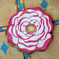
A friend told me about getting canvas by the yard at the fabric store. So, yesterday while we were out we each got some. I came home and just had to play! I used my Sizzex to cut out flowers & leaves. (Tim Holtz Alterations Dies). I sprayed the canvas with Glimmer Mist and in the center I used a rub-on. The only thing about working with the canvas is that it will fray. For what I am using it for on this layout, I am ok with that... but you can use products like Fray Check or sew the edges to prevent fraying. I can't wait to sew with it and make little pockets, etc... (My friend said she would teach me... I sew straight lines, and I am shaky with that! lol...)


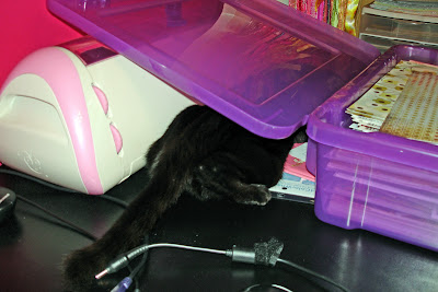
Well, now I have something too cute to share... I went to get something out of my studio this morning and this is what I found...
and went I walked to the other side of my desk, this is what I saw...


Saturday, October 23, 2010

Everyday Love

 I did not have to work Friday, so I scrapbooked! Yippee! So, I started out in my studio to just play with some inking techniques, etc... but then I remembered this sketch contest going on over at PageMaps, and decided to put an inking twist to it!
Here is the sketch:

 Here is my take:
The foundation is a piece of paper from the Lost & Found Stack by Tim Holtz. My flowers were made using white paper, (you would of never guessed, right???) I stamped the various images with Versamark and embossed with a black embossing powder. I then took my Ink Blending Tool and used Crushed Olive, Dried Marigold, & Tumbled Glass to ink up my paper. I put various brads and metals in the center of my flowers. The blue pattern paper is from Tim Holtz Vintage Shabby Paper Pack.

The embossing powder is a resist to the Distress Ink. So you can do it with any color embossing powder. Using white powder creates a really cool effect!


Have a happy day!

Friday, October 22, 2010

Restoration Love

Happy Friday! I am wishing you all a splediferous day! I am sorry I never got to post again yesterday... you know how things get... and then the day is over! Here is the layout that I did yesterday. It is based off of the sketch below. It is for a sketch contest going on over at Crate Paper. I was excited to do this challenge because the sketch is so unique and I knew instantly what paper line I wanted to use: Restoration Collection! I LOVE LOVE LOVE this paper!

Here is my layout:
I used Lace for my foundation. I cut Refinished into a fun shape and inked the edges. I then took Ruffles and cut out the squares and used them to achieve the grid look. Sometimes you have to play a bit... I originally had the 5x5 grid, but then I did 4x4 like the sketch and ended up going back to 5x5. Below are details on my embellishments:

I loved this flower. It is the flower that is on the pattern paper, Slipcover. I cut out three of them: pink, blue, & yellow. I used pop dots to stack them, letting a little of each color show.

Here I used the same paper from above, Slipcover. Using my Tim Holtz Alterations Die Paper Rosette, I cut out and assembled my flower and used a sticker from the sticker sheet for my center.

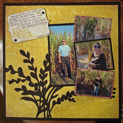
I used the frame from the sticker sheet to put around my picture, and used journaling stickers for my journaling. We took this picture while we were going through the corn maze. I really like it. The journaling says, Remember Romantic Memories.

I hope you were inspired!
 ~~~~~~~~~~~~~~~~~~~~~~~~~~~~~~~~~~~~~~~~~~~~

 So... I had an idea a while back that would help be control by scraps better. I hate throwing away scrap paper, but quite frankly, some pieces are just too small or too narrow to keep. But then I think, "it would work for a card..." knowing that I will never dig through my scrap box for it! The idea is: after I complete a layout, make a card right then!!! It is the perfect plan! All your scraps are right there and everything you have out is coordinating! So, I put my plan to action! Here is a card that I made using the scraps from the above layout:

Thursday, October 21, 2010

Children of the Corn... not really!

Good Morning. I plan on posting twice today, so make sure you come by later to see what I have in stored! Right now I am sharing a layout that I have done for another challenge. I know my last two posts have been challenges too, but they are a lot of fun to do. If you have never played along, I really recommend trying, and who knows, you might win some prizes too!

Below is a sketch from My Mind's Eye. The twist is: Black.

Here is my take on the challenge:
It is actually a very simple layout. I started with a piece of black cardstock. Since I was adhering pattern paper on top of it, I cut out most of the middle, leaving only an edge to glue my paper down to. This way I was able to use one sheet of black cardstock for my whole layout instead of two! (I am all about stretching my supplies!)

I chose papers from the So Sophie Collection. I love My Mind's Eye! There papers are some of the prettiest papers ever! and they are such a good quality: double sided & heavy weighted. The main pattern paper is Graceful "Open Your Heart" Royal Paper. I cut the floral accent out with my Silhouette. As you see, I matted two pictures with black cardstock and the other two with Graceful "Little Lady" Considerate Tulip Paper. I have quite a bit of this purple pattern left over and will make a second page to compliment this layout using the "Little Lady" paper to tie them together.

It is hard to see, but the three little pictures are stair stepped using two different sizes of pop dots. (I love pop dots!) The top picture is adhered directly to the layout. The middle is on small pop dots and the bottom on large pop dots. It gives the layout depth and adds interest.

I hope that you have been inspired and are even considering doing some challenges yourself! As you see by the above layout, it does not have to be an overly complicated layout with all the bells & whistles. Even though you are doing a challenge, you have to adapt the "challenge" part to you & your style. Because, in the end, the layout is going into your album, not theirs!

Tuesday, October 19, 2010

Daddy's Girl

What a beautiful day! Our weather has been so pretty here recently. I have all my windows open and the door to our screened in patio open too. Bella loves it! She runs in and out and sits on the window ledge in the dining room. I love Fall. The temperatures, the leaves changing, all the fall scent candles. It has to be one of my favorite times of the year. It is just inspiring!

Today I have a layout that I did this weekend for the sketch challenge going on over at Imaginisce.
 Here is the sketch:

It is a great sketch. I used the To Love & Cherish Line. It is a BEAUTIFUL line. So elegant and fabulous. Here is my take on the sketch:

I used the back side of the pattern paper Audrey as my background. I cut a pretty flourish out of Bazzil Bling cardstock, Black Tie, using my Cricut and the Cindy Lou cartridge. I cut my three strips out of Audrey too. (This is the front side of the paper). I double matted my photo using a piece of the Bazzil Bling and a piece of Juliet.

Close Up:
I hand cut my flowers out of the Audrey paper. The leaf was cut using the Tattered Leaves Tim Holtz Die, and my tag I cut using my Silhouette. The flourish bling is by Prima. I am very excited about this layout. I absolutely love the To Love & Cherish line!  

This is a special layout for my album because it is a picture that my photographer took right before my dad walked me down the aisle. This layout is about how even though a little girl grows up and gets married and has her husband... Her dad never stops being her hero.

Monday, October 18, 2010

Sketch Challenge.. with a twist!

I'm back! Yippppeee! My studio is still being worked on, but I have been able to set up my desk so I can scrap! I was going crazy! So here is one of the layouts that I did this weekend. It is actually for a challenge going on over at Paper Patch Crafts. It is a challenge based on this sketch:
The catch is it has to be purple, black, & teal. I sat down to play with this layout and was just inspired! It came together so effortlessly and quickly. Here is my layout...

I started with white cardstock for my background and than I kept with it for my layers. I inked the edges of one layer with purple, the other with teal, and the background I inked with black. I used the Cricut cartridge Opposites Attract for my title, "Bella". My flowers I cut using the cartridge, Accent Essentials, the scallop border came from Plantin Schoolbook, and my paisleys came from the cartridge Cindy Lou! (One of my favorites!) It is actually a very simple layout. A little bling in the center of my flowers and some journaling and my layout is complete!


Tuesday, October 12, 2010

a sneak peak...

I have so missed blogging. I have been working quite a bit, but when not working, painting and re-doing my studio. It is coming along quite nicely. I have found the shelving I want at Ikea, (saving up for that now...lol...) and at Michaels, the Jetmax Modular System. I have the pink walls painted and working on trim now. This way I can put my furniture back in place and scrapbook a little as I work on the last wall. I can't wait to play again. I am having withdrawals and need to create! So here is a little picture to show the progress.