Friday, July 30, 2010

Week Four: @Home with Claudine Hellmuth...

Happy Friday Night! Week four just came to a end, and here are the techniques that we learned...

Below is a photo tinting technique using acrylic paint and extra time. I really found it hard to get excited about this technique, so while playing I came up with a different way to use it that I would use more in my scrapbooking. That is what I am absolutely loving about this class: taking the techniques and adapting them to my style and to use on my layouts!

Now this technique was just fun! Using my Texture Boutique to dry emboss Sticky Back Canvas. We also used a Ink Blending Tool, (Tim Holtz), with acrylic paint! It was fabulous!!! The stamp you see to the left is a new Tim Holtz stamp that I got, well new to me! I LOVE IT!

This last technique I have actually done before after watching Claudine do a demo on her website, it is "Transfer onto the back of Sticky Back Canvas". So, this time I tried it with two different pattern papers... it turned out awesome!!! You can't even really see the seam of the two papers where they meet! The potential I see in this! My only problem now is that I am almost out of my Sticky Back Canvas! It is such a fun product to play with and use on your projects!

In talking about Sticky Back Canvas, this layout came to mind that I did right after I bought my canvas... I couldn't wait to for the class to start before I started playing with it! I took a 12 x 12 piece and inked it all up! I used a stencil and sprayed it with Glimmer Mist. I then cut it in half to adhere to my two pages. I then went back and stamped flowers on it using my Memento inks.

Close Up of stamping & spraying on Sticky Back Canvas!
I love this layout because it is documenting our first summer in our house. I took pictures of the details. I was playing with my camera and different angles and lighting... It was a lot of fun and I really like how my shots turned out. Next time you are shooting pictures think about what it would look like if you took the picture from up high or down low. Looking at an angle or straight on. Little changes like that can make all the difference in the world!

Thursday, July 29, 2010

Bright, Beautiful Colors...

Hi! I am going to share two layouts that I finished today... I am excited about how they turned out and all the fun little details I added... also that I got to color with my Copics! So here we go!

This layout I did with papers from Bo Bunny's Paradise collection. I loved the colors and knew the papers would be fun to use with cruise pictures! "Paradise Surf" was my foundation sheet and I cut 5" of "Paradise Batik" and put on top of it. Using the other side of the "Batik" paper, I cut a strip and folded it like a fan and then adhered both ends to my layout. The paper rolls you see I did using scraps from this project and other scraps from my scrap buckets. I used a toothpick to get the rolls started and then a strip of glue at the end to keep them rolled.

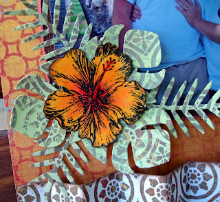
This is a neat embellishment grouping I made using paper, beads, & wire. The flower center was a circle that I cut into a spiral shape and then rolled from the outside in towards the center. I put a little bit of Stickles on the top to give it a little shine. For the beaded leaves, I strung beads onto a very thin piece of wire and then molded them to look like leaves.

The green leaves you see behind my flower were actually cut out from the "Paradise Batik" paper that I used for my paper folding. I used a technique called "Extra Time with Tinted Paper" that I learned in my @Home with Claudine Hellmuth class. After I tinted my paper I cut the leaves out using my Revolution and Quickutz die. The flower is a stamp that I bought in Hawaii back in 2007. I stamped it with Memento Ink and colored it in with my Copic Markers. When putting my embellishment together, I only glued down the end of my leaves that are under the flower. This way I was able to keep some dimension even though I am just using paper!


"Peacock Lane" - Bo Bunny
This was such a fun layout to work on!!! I absolutely love this line and the colors and the patterns! It is all fabulous!!! I cut 1" strips from "Peacock Lane Feathers", "Peacock Lane Flowers", "Peacock Lane Stripe", "Peacock Lane Tweet", "Peacock Lane Plumes". I weaved them together on my cardstock background, (Coredinations Cardstock that is! - got to love it!!!) I then used a template and cut out my paper that you see on the right side of the layout. My pictures are matted in the same color as my background cardstock.
I cut out this scallop from the "Cut Outs" sheet, to use as my journaling block. I pop dotted it to the center of the layout, overlapping my pictures just a bit. The flower border on the lower left side was made up of a stamped image that I colored in with my Copic markers. The center flower I adhered straight to the scallop circle, the two flowers surrounding the center I used small pop dots on and the two outside flowers I used big pop dots on. In doing this, I was able to create a tiered look to my flowers.

This is fun! I stamped the scallop circles onto my paper. The stamp actually had a lot of design in the middle, but I did not ink that part, only the outside got inked. I then made my lines a little bolder with my black Copic marker. Using a 1" square punch I punched out two blocks to be used for journaling. I used pop dots to attach them to my scallop circles. What is neat about this part is that they just hang! I have them connected to each other and then tied to the bottom of the picture.

I love stamps & stamping, but I am a picky stamp buyer at times. This stamp set that I have used is made by Bo Bunny. It is their stamp set from the line Pedal Pushers. I LOVE it! I have used it on several projects and it is just a great stamp to color too!

I hope that you have been inspired today! If you ever have any questions about what I have talked about or done on any of my projects, please leave a comment asking and I will answer.

Until next time... Happy Day!

Sunday, July 25, 2010

Quick Card....

It has been a few days since I posted, but I just wanted to share this card that I made yesterday... It was a lot of fun to make and I really love the wow factor the color from the flowers give it. It was fairly simple to make: I just cut my paper down and adhered it to my card. The scallop circle was cut from a Bo Bunny cut out sheet. My flowers were stamped, (Bo Bunny Stamps...) and colored with Copic Markers. I cut them out and stacked them. The dark pink is adhered directly to the card. The lighter one is on a small pop dot, and the teal flower is on a larger pop dot. It really gives the card dimension!!! Hope you enjoyed! Have a happy Sunday!!!

Friday, July 23, 2010

A Project in the Making....

This album has been in the making for quite some time! It is a Bo-Bunny waterfall chipboard album. One day I decided to spray it with my Tattered Angels Glimmer Mist in Tattered Leather. I was amazed at how awesome it looked! I inked the edges with Tim Holz's Distress Ink in Walnut Stain and that was it! It set up on the shelf with the other "to-do's". Then one day something magical happened... I saw these Graphic 45 papers sitting on the shelf at the scrapbook store in all their glory and instantly was inspired! I have been working on it on and off since then in between layouts and other projects...

I wish I could tell you that this is the completed product... but it is "almost" the completed product. My Aunt is sending my mom several boxes of slides from their childhood and that is where I am going to find most of my pictures. I am making this album a dedication to the generations: My Grandmother & Grandfather, My Mother, and me. I want to show the resemblance between us and also to have pictures of my Grandmother that will be out to look at and share. I never met my Grandmother, but from what I have heard and seen in pictures, she was a fabulous person full of life and personality. She past away due to breast cancer when my mom was in her early twenties. My Grandfather has told me that I look like her and on my wedding day my Aunt told me that I reminded her so much of their mother, and that means a lot to me.

 So that is a little history as to what is going to go into the album... now without further ado: a closeup! 

 
On the front cover I used Prima Flowers that were white and I painted them with Adirondack Paint Dabbers, in Gold and Espresso. The bling you see is also from Prima. The paper is "Hip to the Jive" from the line Times Nouveau Collection from Graphic 45. (All the papers used are from Graphic 45...)

Below is a really neat technique! I learned this from Tim Holtz's "A Compendium of Curiosities". It is rusted grunge. I took Grungeboard, Distress Embossing Powder, and Distress Ink all this together and waa-lah! Rusted Grunge!!!

This is the back of the cover, I used "A Fine Specimen" from the Communique Collection. I cut out the keyhole so you can see all the way through.

 This page was fun! I used a Tim Holtz's Mask and went over it with the Adirondack Gold & Espresso Paint Dabbers. I lightly brushed glue over the one side and added glitter.

The paper on this page is "Society Page" from Communique Collection. The flowers I cut out using Tim Holtz's Alteration Dies. This dies has four flowers on it and it is, I think, one of my most favorite dies ever!!! My friend is the one who actually has the die and Big Shot. I am binding my time til I get it by using one that I cut out and I trace it and fussy cut it every time that I want to use it! A lot of work, but so worth it for these flowers! 

The center of the flowers are embellishments from Vintaj.

 This paper is the back of "Hip to be Jive". I used my flower stencils that I cut out from the Alterations die I talked about from above... I centered the "stencil" on top of one of the clocks and cut it out. Underneath that flower is actually the same flower but used as a mask with Glimmer Mist colors Olive Green & Latte. I did cut out all the flowers from a sheet of Tim Holtz's Masks so I could use them with Glimmer Mist and other inking techniques as well. Did I mention that I love these flowers?

This page actually has a happy accident on it! I stamped my design throughout my page with Versamark and then embossed with clear embossing powder. I then used by Adirondack Gold & Espresso Paint Dabbers to create a Shabby Chic look that is also from "A Compendium of Curiosities". I had fussy cut these shapes from Hip to be Jive earlier in the project but never used them... I laid them out on this page and they fit perfect into my stamped image! (That's my Happy Accident!)

I love stamping with my Paint Dabbers, it truly has a Shabby Chic look. Here I am using a stamp from Tattered Angels. I dabbed a little Gold on in places and then went back with the Espresso to get my two toned look. This is a great way to add a little more to your stamping, and you can use your ink pads too! Just remember to always use your lighter color first so as not to mess up your stamp pads, paint dabbers, etc...

So, I hope that you have enjoyed and have been inspired. I look forward to finishing this album with my pictures soon.

Wednesday, July 21, 2010

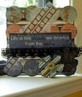
Developing from the negatives....

Here is my weekly project from my class that I am taking over at Big Picture Scrapbooking: @Home with Claudine Hellmuth. It is combining the three techniques that we learned this week. I really enjoyed doing this project. I knew exactly what paper I wanted to use, Bo Bunny's Mama-Razzi Line. The paper's are beautiful and perfect for using not only for layouts and cards, but for home decor. These papers also came to mind because of the saying that I used... it came from the Mama-Razzi Word. It is perfect and I am going to hang this in my studio to remind that the cup is always half full never half empty. I used the following techniques:
-Extra Time Faux Paste Paper
-Extra Time Reverse Stamping
-Extra Time Tinted Paper

I used Tim Holtz Film Strip Tape to add a little embellishment and it goes so perfect with the quote. I used the Alterations Flowers Die for my flowers... What I love about the Bo Bunny papers is that they are double sided, using only three sheets of paper I was able to have 6 different patterns to chose from!

Tuesday, July 20, 2010

look of love:


Good Day Everybody! I am just loving that I have time to create and blog and play in my studio now. Here is a page that I did, (actually it is the second time I scrapped this picture...). The past several weeks have been quite the stressful weeks on my husband and me, work, life, etc... I told him it didn't matter what we went through as long as we went through it together. This past weekend we had a date night at home and looked through our scrapbooks, our honeymoon album was one of them.  This picture was taken on our honeymoon. (Chris was holding the camera and posing!) The original layout was done with a paper that the picture just got lost in and I did a rub-on that was lost in the paper as well... It just didn't suit. I was inspired and took the layout and re-did it completely! As you can see I even got my husband involved too!

The Bo Bunny papers suit this picture so well. With all their lines, Bo Bunny offers a cut out sheet, it is double sided and just fabulous! That is where I got my journaling blocks and the scallop circle on the side of the picture. I have been using this paper quite a bit... by the time that I got to this layout I was working with a limited supply. But that is a fun challenge with using your scraps and supplies, making it go til it cannot go anymore! The scallop circle was actually cut in half, it came from the cut out sheet as well, and I had used what was on the other side... But I used my picture and made what I had work for me.

How do you make your supplies work for you and go the absolute farthest they can go???

Some neat things on the layout:
-The journaling my husband did for me, "Things that make you U" is not glued down.
It is hanging from the picture using jump rings.
- My green flower I cut out from some of the scraps I had left, the blue flower is actually from the same paper line, but I used gesso and transferred it to fabric. (This is a technique that I recently learned in my Claudine Hellmuth class).
- and I "I-Rocked" my layout! The bling that you see is custom! I used a stencil and my I-Rock tool to add fun swirls and a little bit more color to my page.

Monday, July 19, 2010

Sweet Memories

I love these layouts! I did them a while back using the Bo Bunny Persuasion line. I love working with Bo Bunny Papers because of the colors. They always have such fabulous color combinations and their product are a good quality too! My only complaint... I have to usually buy 4 sheets of each design! lol... they are double sided and I usually love both sides. When I buy paper I try to buy two sheets of each because I love doing double page layouts and I like to have the option of making the pattern paper my background... and I am just a paper addict too! (shhh... don't tell my husband!)

Below: This was such a special and fun day for us: we went and got our marriage license! I was so happy and so in love! (still am...). There are several things I want to point out on the layouts below...

First of all, so you see that really cool piece of pattern paper that is shaped in the background? I love this shape! I traced it onto a piece of plain cardstock and have used it so many times with different pattern papers. (It is from the Bo Bunny Love Bandit Line).

My title, "smiling", was cut from my Silhouette. I cut it out of the Black Magic Line from Core'dinations Cardstock. I ran it through my Texture Boutique to emboss it, and then sanded the top to reveal the blue that is underneath the black! This is really great cardstock!

The red flower that I have on the layout above actually had longer petals. I needed it to fit inside the circle on my Bo Bunny Sticker so I trimmed the ends off! I really like the shape of the flower now also, instead of pointed petals it has flat ends...

I doodled around the edges of my shaped paper. The swirl that you see behind the flower is a piece of chipboard. I painted it and then applied Distress Crackle Paint in Rock Candy.
The word "amour" I cut out of my Silhouette and was planning on using on this page, but I love this paper too much to cover up. So, instead, I traced it onto my paper and colored it in with my Copic Markers. There is no fancy shading or coloring techniques, just coloring with one color and outlining in another.

The heart behind the journaling was done like the title on the other page, except that I used a different texture plate. The decorative corners on my pictures were stickers off of the Bo Bunny Sticker Sheet that was apart of the Persuasion line. If I needed more it is a shape that can easily be cut out of any paper and used.

On a side note...
Scrapbooking does bring back so many memories as you are working on your layouts. One thing that I am going to go back and add to the second layout is a hidden journaling tag. When we see pictures we usually think of the subjects that are in the picture, but not the person behind the camera. The picture of the both of us together holding our license is very special, not only because of the event, but because of who took our picture. It was my friend Debbie. She was the receptionist at where I used to work. I loved talking with her and she watched Chris & I date and fall in love and was one of the first people I told that I was engaged. When we got back to the office after getting our marriage license she was just as excited as I was! I remember us squealing like girls do and then her asking if we wanted a picture together... These pictures were taken September 15, 2006. Debbie passed away in December 2008. I miss her dearly and though these layouts record a special day in mine & Chris' lives, it also is a sweet memory of a dear friend.

Next time you are scrapping pictures and you think about the story behind the picture to add to your layout, ask yourself if there are any "hidden" stories that you would like to record as well. Celebrating this day with Debbie is a special memory and I am going to go back and add it to my layout. It is a memory that does not need to be forgotten.

Week Three yields a favorite technique...

Oh the possibilities! That is what I have to say about all that I am learning in this class! The possibilities are endless... and I am loving it! Below I have the next three techniques. All which are using a product called Extra Time. It is a translucent looking medium that you mix into your paints so that they take a longer time to dry, giving you the ability to PLAY! ...and let me tell you, I am playing!!!

This first is "Extra Time with Tinted Paper". I believe this might be one of my favorites! It is basically a wash of color you can use to add a tint to scrapbooking pages, stickers, canvas, etc... it is FABULOUS!

Below: This is by far my least favorite... and it is just because I need to practice! lol.. This is "Extra Time Reverse Stamping". It has potential, don't get me wrong.... I just haven't been able to get it right yet... I am also out of glossy paper, so I played on some regular scrapbooking paper and sticky back canvas. If you look real close, you can see swirls on the flower and a tree on the layout... but look carefully! lol... hopefully, with a little practice I will conquer this technique!

Below: This technique is just fun! "Extra Time Faux Paste Paper". The design was made by using a comb! This was my last scrap of glossy paper, (I just knew I had some, but I guess not... I searched my studio high & low!). After painting our mixture on we used the comb to make fun designs! The possibilities with this are just endless! Just imagine all that you can use to make textures and designs... not just a comb!

So, as you can see this class has been stuffed full of techniques, and we are just on week 3! Oh Boy! the fun to come...

Friday, July 16, 2010

Week Two Techniques...

WaterMark Resist Technique


Watermark Resist Peeled Paint


Acrylic Paint Stamping with Extra Time Technique


These were the techniques that we learned in week two. I really like the Watermark Resist Technique and the Acrylic Paint Stamping with Extra Time Technique. I feel that I need to work on the Watermark Resist Peeled Paint Technique some... I see so much potential with all the techniques I have learned! I am loving my little technique book that we are making. More to come....

Thursday, July 15, 2010

Fire & Ice - Gesso Transfer Canvas Project

Here is my Week One Project for my @Home with Claudine Hellmuth. I used a Gesso Transfer technique that I learned. I used a Twilight picture I found on the Internet. I think that this is a technique that I need to practice... it is an awesome technique but several factors matter I am finding out...
inkjet print vs. copy machine toner
the amount of gesso used
the amount of water used to peel off the back
I will probably add some more to my canvas once I get a little more inspiration.
As of now though, I stamped a corner flourish using a paint dabber and added a pretty charm to the bottom to dangle. I wrote the poem "Fire & Ice" by Robert Frost which is at the front of the third Twilight book, "Eclipse".

Friday, July 9, 2010

@Home with Claudine Hellmuth - Week One

Gesso Transfer: This is a fabulous technique. I have four canvases laying out in my studio floor drying... Oh I can't wait to get working on them!

Thursday, July 8, 2010

one more present...


Here is a layout that I did a while back... It is of a very precious moment and I wanted this layout to be perfect... (this is the third attempt!). I reached perfection on this try.

Look at how I divided my paper. This is a good trick when you only have one sheet of patterned paper and you want to do a 2 page layout. My 12 x 12 background paper is white. I cut the green polka dots in half and put on the top of each side and then the bottom is a Hambley Screen Print cut, too.

My tag is from "The 12 Tags of Christmas 2009" that Tim Holtz does on his blog. I loved my tags that I made, but I love the fact more that I can use them for embellishments.

Don't be afraid to mix lines either... the happy ever after embellishment you seen in the right corner is actually a rub-on from a Valentine's Day line! and I am using it for Christmas...

of course this event had to include journaling, quite a bit... so I just bit the bullet and wrote it all out... because I knew I had a lot to write, I did it on a piece of paper that I could add to my layout. This way if I messed up, I could start over and not ruin my layout...

I hope you have enjoyed, let me know what you think!

Wednesday, July 7, 2010

Gesso Etching Technique:

Gesso Etching: This is the first technique that I have learned in my @Home with Claudine Hellmuth class.
Gesso is a lot of fun! Messy, but fun!

Friday, July 2, 2010

So, what can this I-Rock thing do???

Did I mention that I like the I-Rock, love the I-Rock? To have such pretty bling and to be able to arrange it however you want and it stay there... oh it is so fabulous!

Here are a couple of cards I made today using the I-Rock. The first card I used a Hero Arts Background stamp. The flowers I cut out of Claudine Hellmuth's Sticky Back Canvas using Tim Holtz's Flower Dies. To get the pattern for my bling, I used a Crafter's Workshop template.


The card below I made using Cosmo Cricket's Delovely line. I then used the circles as a pattern to place my bling. The scallop square is also a Hero Arts Stamp. The sentiment is from Unity Stamps.


~~~~~~~~~~~~~~~~~~~~~~~~~~~~~~~~~~~~~~~~~~~~~~~~~~~~~~~

Now, for some fun news... this summer I am taking a class over at Big Picture Scrapbooking. It is called, @Home with Claudine Hellmuth. I am really excited about all the techniques I am going to be learning. I am going to be posting my projects, etc. throughout the class. We started yesterday, here is a peak at one of the first techniques that we are learning...